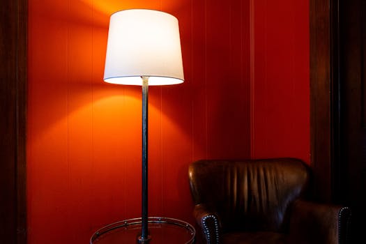

Ever walked into a tiny room and felt like you were about to be swallowed whole by its walls? Yeah, me too. It’s like being trapped in a stylish, yet slightly suffocating, jewelry box. But what if I told you that with a little judicious application of paint, you could transform that cramped corner into a seemingly expansive sanctuary? It’s not magic, though it feels like it. It’s all about understanding the subtle, yet powerful, language of color. For those of us battling the square footage blues, mastering color schemes for small rooms is less about decoration and more about strategic illusion. So, let’s dive in and learn how to make your diminutive domains feel delightfully grand.
Painting with Light: The Lighter the Better (Usually)
This is the golden rule, the non-negotiable starting point for most small spaces. Light colors, as you might have guessed, reflect more light. This bouncing of light around the room makes it appear larger and more airy. Think of it like a well-placed mirror, but on a grand, wall-sized scale.
Whites and Off-Whites: These are your trusty steeds. They’re not just for hospitals or minimalist art galleries anymore! A soft, warm white can make a room feel inviting without feeling stark. An off-white with a hint of cream or beige adds a touch of coziness. The key here is to avoid anything too stark unless you’re going for a very specific, crisp aesthetic.
Pastels and Muted Tones: Think sky blue, pale mint green, dusty rose, or a soft lavender. These colors offer a gentle embrace. They add personality without overwhelming the senses or visually shrinking the space further. A pale blue, for instance, can evoke the feeling of an open sky, instantly lifting the room.
Cool Neutrals: Greys and greiges (grey-beige) can also work wonders. A light, cool grey can make walls recede, creating a sense of depth. Just be mindful of undertones – you don’t want a grey that leans too yellow or blue unless that’s part of your carefully curated scheme.
One thing to keep in mind is the natural light a room receives. If a room is north-facing and gets little direct sunlight, you might opt for warmer off-whites or pastels to counteract any potential chill. Conversely, a bright, south-facing room can handle cooler tones with ease.
The Illusion of Depth: Creating Visual “Breathing Room”
Beyond just choosing light colors, we can manipulate how we use color to trick the eye. It’s like a visual Houdini act, making walls disappear and corners expand. This is where understanding the science and psychology of color really comes into play.
#### Ceiling Secrets: Lifting the Roof (Metaphorically)
Often, the ceiling is an afterthought. But in a small room, it’s prime real estate for creating height.
Paint it White or Lighter: The classic move is to paint the ceiling a shade lighter than the walls, or simply white. This draws the eye upward, making the room feel taller. It’s like giving your room a permanent blue sky.
Consider a Gloss Finish: A subtle satin or eggshell finish on the ceiling can reflect light more effectively than a matte finish, further enhancing that sense of openness. Just don’t go full high-gloss unless you really love seeing every imperfection, including your own reflection looking bewildered at the ceiling.
Strategic Pops: When to Dare and How to Do It
Now, I know what you’re thinking: “Does this mean I have to live in a world of beige and pastel forever?” Absolutely not! The key is strategic pops of color. Think of them as carefully placed accessories that draw attention and add personality without making the room feel chaotic or smaller.
#### Accent Walls: A Calculated Risk
An accent wall can add depth and visual interest. The trick is which wall and what color.
The “End” Wall: In a rectangular room, painting the wall at the far end a slightly darker or bolder color can actually pull that wall towards you, making the room feel more proportionate and less like a tunnel.
Avoid Busy Patterns: While patterns can be fun, overly busy or dark patterns on an accent wall can sometimes make the space feel smaller. Stick to solid, richer colors for a more sophisticated effect.
Consider the “Fourth Wall”: Sometimes, the wall that’s least in your direct line of sight when you enter is a good candidate. This can be a fun surprise without being in your face constantly.
#### Furniture and Decor: Where the Fun Really Happens
This is your playground! Smaller pieces of furniture in bolder colors, vibrant throw pillows, eye-catching artwork, or a statement rug can inject personality.
Think “Floating” Furniture: Furniture with legs, especially in lighter or mid-tone colors, can create a sense of openness underneath, making the floor appear larger.
Mirror, Mirror, on the Wall: This isn’t just for fairytales. Mirrors are your best friend in small spaces. Place them opposite windows to reflect light and views, or on a wall to create the illusion of depth. A strategically placed mirror can practically double the perceived size of a room.
Working with What You’ve Got: Embracing the Cozy
Sometimes, the goal isn’t to make a room feel vastly larger, but rather to make it feel comfortably so. This is where embracing coziness comes into play.
#### Deeper Hues: A Sophisticated Choice
For some, the idea of light colors feels too… well, vanilla. And that’s okay! It is possible to use deeper, richer color schemes for small rooms without them feeling like a dark abyss.
Monochromatic Magic: Using different shades and tints of the same color can create a sophisticated and cohesive look. A deep teal room with lighter teal accents and perhaps some metallic touches can feel incredibly inviting and luxurious.
The “Jewel Box” Effect: Think of a beautifully appointed jewelry box. It’s small, but it’s filled with rich textures and colors that feel precious and enveloping. Deep blues, emerald greens, or even a moody burgundy can work if balanced with ample lighting and reflective surfaces.
Contrast is Key: If you’re using a darker color, ensure you have plenty of light sources – both natural and artificial. High-contrast elements, like a white ceiling against a dark wall, can also help define the space and prevent it from feeling flat.
#### Color Consistency: A Unified Vision
One common pitfall is painting every wall a different, unrelated color. This visually chops up the space, making it feel smaller and more fragmented.
Flow is Your Friend: For an open-plan living area or a series of connected rooms, maintaining a consistent color palette throughout creates a sense of flow and unity, making the entire area feel larger.
* The “Color Bridge”: Even if you have distinct zones, you can use a common accent color or a similar shade to link them visually.
Final Thoughts: Painting Your Way to Perceived Space
So, there you have it. Making color schemes for small rooms work for you is all about understanding how color interacts with light and our perception. It’s about strategic choices, a touch of creativity, and a willingness to experiment. Remember, a small room doesn’t have to feel insignificant. With the right color palette, you can create a space that feels bright, inviting, and surprisingly spacious. It’s your canvas, so go ahead and paint your dreams into reality – one colorful brushstroke at a time!